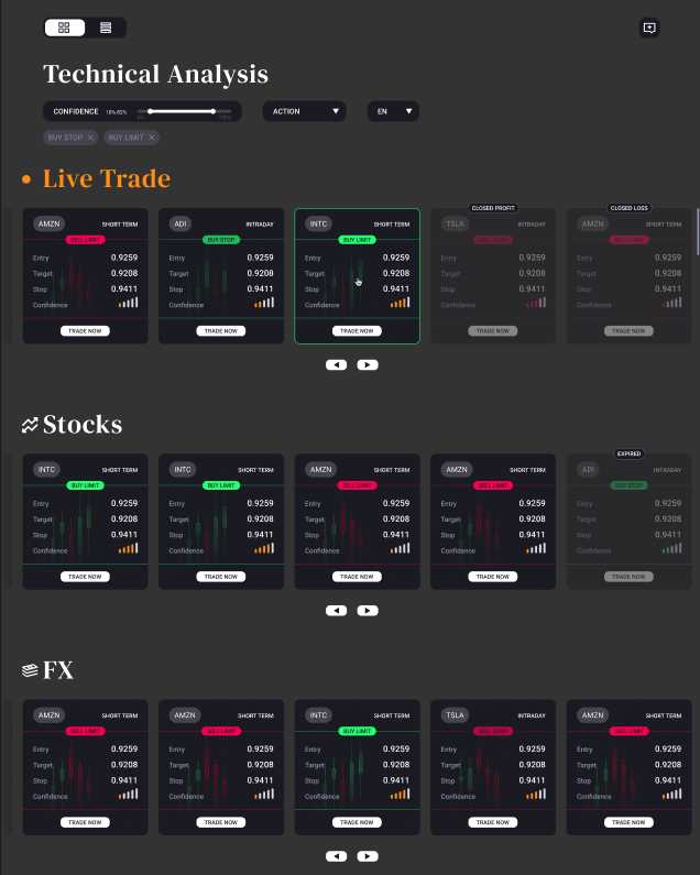
The original version of AnalysisIQ had trade ideas grouped by asset classes by default. We’ve received some feedback that it can be inconvenient, especially if the user is interested in a particular asset class which is not immediately visible.
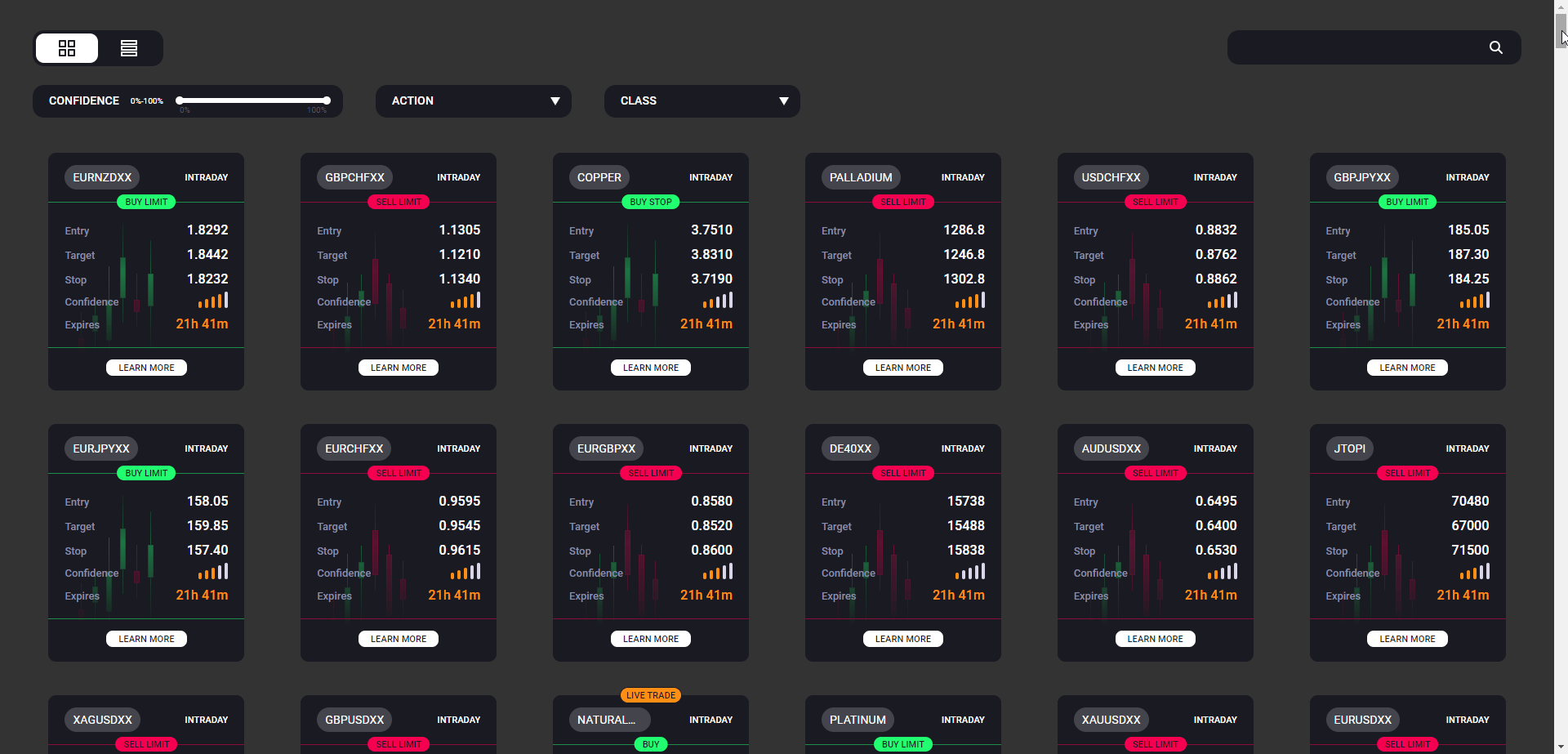
To resolve the concerns, we’ve implemented a more natural publication time based ordering in the dashboard. Additionally, we’ve implemented a filter that allows users to display trade ideas related to a single asset class should they wish to do so.
Original layout:
Improved layout:
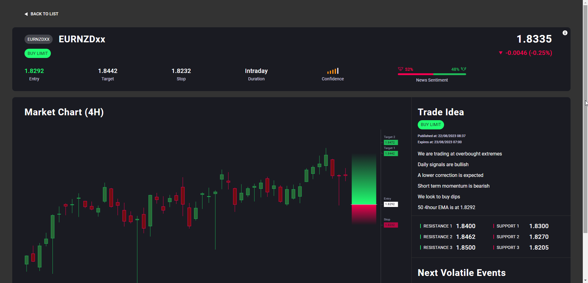
As part of the same update, we looked at how the information is structured inside the full trade idea view. Previously, a large portion of the tool was occupied by the chart and the important details, such as the trade idea justification, were hidden from the users. We’ve now made sure that the prominent details are immediately visible.
This is how the details appear after the update:
Product Updates,
Trading Tools & Platforms,
Research Terminal,
Signal Stream,
AnalysisIQ